Logo design concepts for cleaning brands
Cleaning service logo color psychology – Explore colors that convey cleanliness, trust, and professionalism for cleaning businesses.
Logo impressions form in a mere 0.05 seconds—a flash of line and colour that hints at reliability. In the cleaning world, that first mark speaks of cleanliness, trust, and professionalism. The right approach can mean a call back instead of a scroll past, and these logo ideas for cleaning company are more than decoration; they’re commitments bottled in ink and shape.
Colour psychology is your ally. Blues and cool greys convey freshness and dependability, while a touch of green signals eco-conscious care. For South Africa, high contrast aids legibility on vehicles and uniforms as streets grow busier by the day. The palette should remain restrained to keep the mark legible and enduring.
- Blue with charcoal for trust
- Teal with navy for a modern eco vibe
- Green with white for approachability
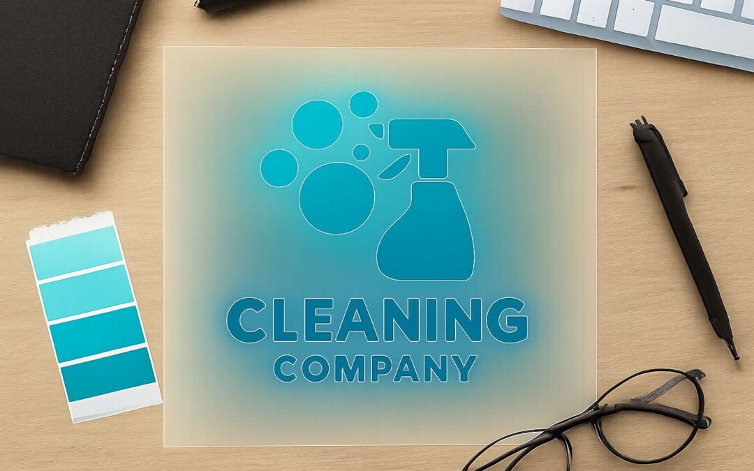
Iconography should feel clean and purposeful. A water droplet, a bubble, or a minimal spray form can carry the message without clutter. When paired with a simple wordmark, such symbols create lasting recognition for logo ideas for cleaning company across varied markets.
Symbol ideas for cleaning logos – Bubbles, spray bottles, mops, water droplets, and sparkles to represent cleanliness.
Logo design concepts for cleaning brands hinge on clarity and instinct. These logo ideas for cleaning company set the tone for trust and speed. A strong mark reads in a flash, even from a moving vehicle.
Symbol ideas should be simple and legible at small scales and from afar.
- Bubbles
- Spray bottles
- Mops
- Water droplets
- Sparkles
When paired with a restrained wordmark, these icons stay usable across uniforms, vehicles, and digital touchpoints.
Typography for cleaning brand logos – Sans-serif and rounded typefaces that ensure legibility across sizes.
“A good logo is a silent salesperson,” a branding veteran once said, and that truth lands hardest on the crowded streets of South Africa. In a glance, a brand communicates trust, speed, and reliability—before a customer reads a single word.
Typography for cleaning brand logos hinges on sans-serif and rounded typefaces that ensure legibility across sizes. Sharp, clean letters survive on bus doors, uniforms, and small mobile screens, while friendly curves soften the stance of a brisk service. This is essential for logo ideas for cleaning company, because the message must endure as objects in motion pass by.
- Sans-serif clarity with even stroke width
- Rounded terminals to convey approachability
- High x-height for quick recognition
Pair typography with restrained branding so the logo appears confident on every touchpoint—from fleet decals to digital banners. The goal isn’t flair alone but readability at a glance, a hard-won clarity that speaks to professionalism in South Africa’s diverse market, aligning with the broader aim of logo ideas for cleaning company.
Minimalist logo ideas for cleaners – Why simple marks work and how to create clean, memorable logos.
“A good logo is a silent salesperson,” a branding veteran once said. In a market saturated with loud icons, logo ideas for cleaning company cut through the chatter. A clean, single-mark image travels far—across fleet decals, uniforms, and mobile screens with effortless recognition.
Minimalist marks thrive by saying more with less. They anchor a brand in memory through simple geometry, clear silhouettes, and restrained color.
- One-gesture symbol that captures core service
- Bold silhouette with clean lines
- Monochrome or high-contrast color pairing
To create such logos, begin with a strong concept and prune distractions, allowing negative space to shape meaning. The result is a flexible mark that remains legible at any scale.
For South Africa’s diverse markets, that legibility translates into trust on the move—on buses, in shopping centers, and in crowded digital feeds.
Brand storytelling through cleaning logo design
Narrative-driven logo concepts for cleaners – Encode brand story into iconography and typography.
Brand storytelling in logo design is not a splash of color but a heartbeat you wear. In South Africa’s busy towns, a single emblem can carry a hundred memories, turning a cleaning cloth into trust. A well-tuned mark invites customers to pause, lean in, and believe in your promise!
- Iconography that encodes origin and promise—an old-fashioned broomhead, a shield of protection, a sweep of light suggesting renewal.
- Typography that speaks softly yet clearly—rounded sans to mirror approachability and reliability.
- Color and texture as memory—subtle blues and greens with a tactile finish that hints at cleanliness and care.
Narrative-driven logo concepts for cleaners arrive when a brand’s journey is allowed to speak through mark and letter. Encode brand story into iconography and typography, letting the image carry values, not just looks. That’s where logo ideas for cleaning company begin.
Geography and local identifiers in logos – Using city initials or local landmarks to signal local service.
Brand storytelling in SA logos hits where it matters: trust that travels faster than a taxi on a Friday. In South Africa’s bustling towns, a mark anchored in place communicates reliability before a single sentence is read. Geography-light elements—city initials, recognizable landmarks, or a skyline silhouette—signal local service without shouting. The result is a badge you can wear on a van window and in a customer’s good faith.
For those chasing logo ideas for cleaning company, think about city initials like JHB, CPT, DBN or a Table Mountain outline; it signals local service with pride. A simple silhouette paired with friendly type keeps the design legible on screens and on cleaning gear. It forges a memorable cue that sticks when a client recalls their last spotless week.
- JHB
- CPT
- DBN
- Table Mountain silhouette
Highlighting eco-friendly values in logos – Green color schemes, leaf motifs, and water-conscious symbols.
Brand storytelling through cleaning logo design travels fast, especially in South Africa’s busy towns. For logo ideas for cleaning company, eco-friendly signals set the tone in a single glance. Green hues paired with a simple, nature-inspired mark communicate responsibility before a customer even reads a line.
Core eco values live in the visuals: green color schemes, leaf motifs, and water-conscious symbols that nod to responsible cleaning practices without shouting. These elements deepen the story and keep the logo legible on uniforms, vans, and screens, creating an instantly recognizable cue.
Across South Africa—from Johannesburg to Cape Town—the eco-forward approach acts as a portable badge of care. logo ideas for cleaning company travel on vans and in reputations, inviting trust and making your brand the first thing customers remember after a spotless week.
Target audience focused logo ideas for cleaning services – Residential versus commercial branding considerations.
A logo is the quiet spokesperson of your service. A good logo tells your story in one glance. In South Africa’s bustling towns, a single emblem can evoke trust before a word is spoken. Brand storytelling through cleaning logo design makes the brand’s promise tangible, and logo ideas for cleaning company carry meaning from the first glance to the last brushstroke.
- Residential branding cues: friendly shapes, softer contrasts, and personal touches.
- Commercial branding cues: high-contrast readability, fleet visibility, and professional typography.
I’ve watched logos travel across vans, uniforms, and screens, turning a simple mark into a portable story. Let the icon whisper your values—green for care, water motifs for responsible cleaning, and clean typography for legibility at any size!
Seasonal and flexible logo design tips – Create adaptable logos for campaigns and service variations.
Across South Africa’s busy streets, a logo often speaks before a word is spoken. A logo is the quiet spokesperson of your service, and brand storytelling through cleaning logo design turns routine cleaning into a promise customers can feel in an instant. It travels from vans to uniforms to screens, whispering reliability.
Seasonal and flexible logo design embraces change without erasing identity. Picture modular marks that shift color blocks or icon weight for campaigns and service variations, while keeping the core typography steady. This approach keeps your brand legible, relevant, and memorable as tides turn and markets dance around you.
In crafting logo ideas for cleaning company, designers feel local, resonating with South Africa’s towns and trust networks. Tapping into logo ideas for cleaning company, designers weave seasonal color shifts and adaptable lockups that stay true to the core.
Practical design guidelines for cleaning company logos
Logo scalability and readability – Ensure legibility at small sizes and across print materials.
In a crowded marketplace, a logo is a doorway to trust, not a decoration. For logo ideas for cleaning company, simplicity speaks louder than complexity, especially on business cards, vehicle magnets, and uniforms. A clean mark endures; it reads in seconds, even when size is tiny and lighting unforgiving. In South Africa’s diverse landscape, legibility is a moral choice—clarity travels farther than flair.
Principles guide the craft: prioritize scalable design and readability. Favor bold shapes over fine detail, and maintain high contrast so the mark survives print and screen. A logo should perform in color and monochrome, across digital icons and large banners alike. Test legibility at small sizes and across materials, from a letterhead to a storefront sign. These principles translate into logo ideas for cleaning company that endure.
Color palette guidelines for cleaners – Choose high-contrast palettes with accessibility in mind.
Three seconds is all it takes for a first impression to click—your logo either invites trust or invites the next inquiry. In South Africa’s crowded cleaning market, practical design means bold shapes, minimal detail, and strong negative space that reads on business cards, vehicle magnets, and uniforms alike.
Color palettes demand high contrast and accessibility. In design for cleaners, legibility on print and screen is non-negotiable. Here are guiding tones:
- High-contrast combinations (dark core with light accents) improve readability.
- Test for color vision deficiencies; ensure monochrome legibility.
- Choose colors that reproduce well in both print and digital environments.
All these considerations crystallize into logo ideas for cleaning company that endure.
Iconography that communicates cleaning action – Mops, spray bottles, bubbles, and squeegees to convey action.
First impressions train the eye in an instant, and a logo’s trustworthiness can be decided in as little as 50 milliseconds. For cleaners, iconography that communicates action matters: a mark that looks like it’s doing something—sweeping, spraying, sparkling—reads as capable before a potential client even speaks.
Readability across sizes matters; opt for bold silhouettes, clean lines, and deliberate negative space that suggests movement. Mops, spray bottles, bubbles, and squeegees can be combined into compact marks that feel dynamic rather than busy, ensuring legibility on business cards, magnets, and uniforms.
- Mops
- Spray bottles
- Bubbles
- Squeegees
Together, these cues crystallize into logo ideas for cleaning company that are practical yet magical, ready to stand out in a crowded market.
Typography hierarchy and brand mark balance – Balance between wordmark and symbol, font weights, and spacing.
Typography can cement trust in as little as 250 milliseconds—a moment that can make or break a prospective client. This is why logo ideas for cleaning company hinge on typographic clarity that reads cleanly on business cards, magnets, uniforms, and signage across South Africa.
Typography hierarchy is the backbone: pair a strong wordmark with a restrained symbol, using two weights max and spacing that keep both elements legible across sizes. Balance between wordmark and symbol means neither dominates; a shared baseline creates cohesion. That balance informs the logo ideas for cleaning company, ensuring the mark reads as a complete system rather than a rumor of design.
- Shared baseline and balance keep wordmark and symbol as a single unit.
- Restrained two-weight pairing preserves clarity across sizes.
- Deliberate tracking and leading give breathing room for legibility.
- Real-world testing across cards, magnets, and uniforms confirms balance.
Logo customization for different cleaning niches
Residential housekeeping logo ideas – Soft, friendly designs suitable for home cleaning services.
Brand impressions settle in three seconds, and in South Africa that split-second decision can seal a client’s fate. For logo ideas for cleaning company aimed at residential work, soft, friendly aesthetics communicate home warmth before a single step is taken. A homey mark radiates trust and makes a first impression linger.
To tailor for homes, emphasize ease and approachability with gentle curves and a restrained palette. Consider these in your design:
- Soft color palette in warm neutrals and pastels, reading well at small sizes
- Rounded wordmark paired with a simple, domestic motif
- Clean typography with generous tracking for legibility
These choices keep the logo legible across SA neighborhoods and adaptable for varying campaigns, without shouting for attention.
Commercial cleaning logo ideas – Professional, bold logos aimed at corporate clients.
Brand impressions settle in three seconds, and in South Africa’s boardrooms that moment decides whether a partnership sticks. For commercial cleaning, the logo must radiate reliability, authority, and efficiency at a single glance. When refining logo ideas for cleaning company that targets corporate clients, aim for bold aesthetics that scale from lobby signage to corporate gifts.
Think of a compact, geometric mark paired with a strong sans-serif wordmark—lines that speak of precision and accountability. Here are design traits that resonate in boardrooms rather than break rooms:
- Bold geometry with high contrast for visibility on signage, vehicles, and screens.
- A restrained, professional color palette (navy, charcoal, steel) that endures campaigns.
- A scalable icon that remains legible as a favicon or stamp and maintains brand energy in print and digital.
Industrial cleaning logo ideas – Heavy-duty symbols with dynamic motion elements.
Three seconds—that’s how long a client in South Africa’s industrial corridors takes to size up an industrial cleaning partner. For logo ideas for cleaning company aimed at heavy-industry accounts, the mark must feel heft, durability, and momentum. Think heavy-duty symbols—gears, clamps, pipelines—paired with bold, kinetic motion elements that suggest performance on site.
A compact geometric icon paired with a strong sans-serif wordmark reads as authority on banners, service vans, and business cards. For industrial niches, lean toward a steel-inspired palette—charcoal, navy, steel—and ensure the mark remains legible when scaled to a favicon or stamp. These choices convey reliability and pace without shouting.
- Heavy-duty symbols like gears, bolts, or pipelines establish instant relevance.
- Dynamic motion elements such as diagonal strokes or swooshes imply on-site efficiency.
- Bold, high-contrast geometry preserves legibility across signage and digital screens.
Eco-friendly and green cleaning logos – Sustainable symbolism and eco-conscious color schemes.
South Africa’s pace is fierce, and a logo can seal a deal in a breath. “Brand trust travels faster than a diesel train,” notes a leading SA branding executive, reminding designers that eco-conscious signals must be immediate and unmistakable. Eco-friendly logo customization leans into sustainable symbolism, aligning visuals with responsible practices rather than greenwashing.
Think of a mark that marries clean lines with nature cues—leaves, droplets, or a gentle wave—paired with a color story that respects scarce water. Use eco-conscious palettes—deep forest greens, slate, charcoal, ocean blues, and earthy neutrals—to convey reliability without shouting. The best marks stay legible on signage, digital screens, and small stamps.
For a compact visual vocabulary, consider the following elements:
- Leaf motifs
- Water symbolism
These choices feed into logo ideas for cleaning company that aim to resonate with both residential and commercial clients.
In South Africa, the palette and proportion matter as much as the idea itself.
Emergency cleaning services branding concepts – High-contrast, urgent visuals that convey reliability.
South Africa moves at a relentless tempo, where a logo can clinch a deal in seconds. For logo ideas for cleaning company, emergency branding concepts lean into high-contrast, urgent visuals that communicate reliability at a glance, not after a second thought. The aim is instant trust that survives on signage, screens, and uniforms.
Visual cues lean into high-contrast palettes, bold typography, and compact marks that stay legible from a distance. Imagine a stopwatch fused with a squeegee, or a sharp wave signaling swift, dependable service.
For South African audiences, color choices should read as serious and trustworthy—deep charcoal, crimson accents, and clean whites that translate across crews’ uniforms, vehicle livery, and emergency boards.
In the end, the emblem should scream reliability at a glance, becoming one of the logo ideas for cleaning company that survive every square centimeter of South Africa’s fast-paced world.
On-site and mobile cleaning branding considerations – Logos that work well on vans, uniforms, and equipment.
Your logo travels faster than your service! In South Africa’s relentless tempo, a mark on a van, a uniform, or a badge is the handshake with a client. I see logo ideas for cleaning company becoming a live signature that speaks before you step out — bold, compact, legible from curb to boardroom. It must glow on signage, screens, and uniforms, turning quick impressions into lasting trust.
On-site and mobile branding hinge on legibility and adaptability. A strong emblem should compress into a badge or stretch across a wrap without losing its core identity. For vans, keep it bold and simplified; for uniforms, test embroidery readability; for equipment, a compact mark fits small labels. Consider a secondary lockup for environments.
- Vans and vehicle wraps: bold, high-contrast, simplified marks
- Uniforms and PPE: scalable for embroidery or heat transfer, reflecting logo ideas for cleaning company
- Equipment and signage: legible at small sizes and in various light conditions
